
by Natasha Cirisano
Japanese calligraphy in four words: Harder. Than. It. Looks. On our first Saturday at the Yamanaka Lake retreat, the Meiji students set up a calligraphy lesson for us to learn to write our names. I’m a design major, so I thought it wouldn’t be too difficult… but I was wrong. Three characters might seem easy at first, but the calligraphy really showed me the care and importance that goes into every stroke of Japanese writing. In Japanese language class, we learned how to write the alphabet with an emphasis on the stroke direction and stroke order of each letter. At first I thought this was just a tedious, extra element to memorize, but when we did calligraphy I saw how these ideas really stemmed from the way the ink medium worked when these letters were written with a brush back in the old days. The direction and order of the strokes are crucial to create the particular weight and balance the letter needs, and passing the brush across the paper in the wrong direction makes the letter much harder to draw because it is against the flow of the ink.
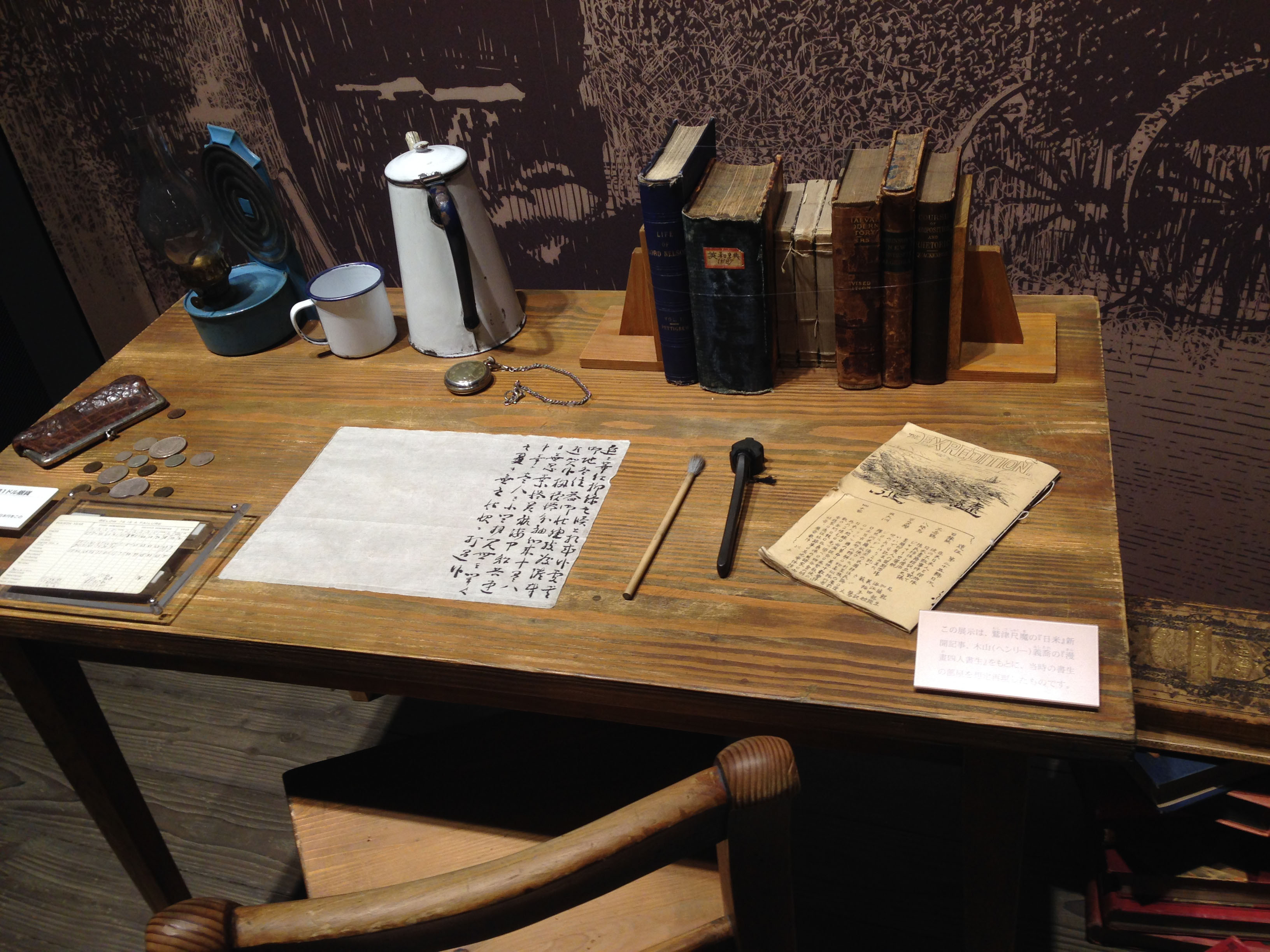
An ink-brush set-up from around the late 1800s at the Japanese Migration Museum. Our brushes were much thicker than the one pictured here, but I was surprised by the way that I could still achieve a very fine line by rolling the bristles into a point.
Compared to Western calligraphy, which also depends heavily on the direction and order of the strokes, the Japanese version is much more about showing motion even though the letters are static forms. While I usually picture monks hunched over parchment paper with quill pens painstakingly shaping every letter, Japanese calligraphy is more like a dance between concentration and spontaneity. I felt like the letters were people doing ballet or maybe even martial arts – one stroke, an arm jabbing to the right, the next, a leg kicking up and then coming down again. The art is mental as much as it is physical, and I had to train my muscle memory as much as my mind to make it beautiful. For example, to be successful, I had to get used to holding the brush upright at a 90-degree angle from the paper, which feels awkward at first, but provides a lot more control over the thickness and thinness of the strokes. Kenta, my teacher, kept correcting me when I fell back into holding the brush like a normal pencil! Next, the composition was the mental part; I had to pay attention to the angle of the strokes or else everything would look awkward and out of balance. It’s funny, because even though I could not read the characters, I could tell when a stroke “felt” wrong. Good design is a universal language. It seems that even people who come from two different sides of the world can “sense” compositional oddities and imbalances, even if one person (me!) first sees the characters as abstract art rather than as instruments of ideological and symbolic meaning.
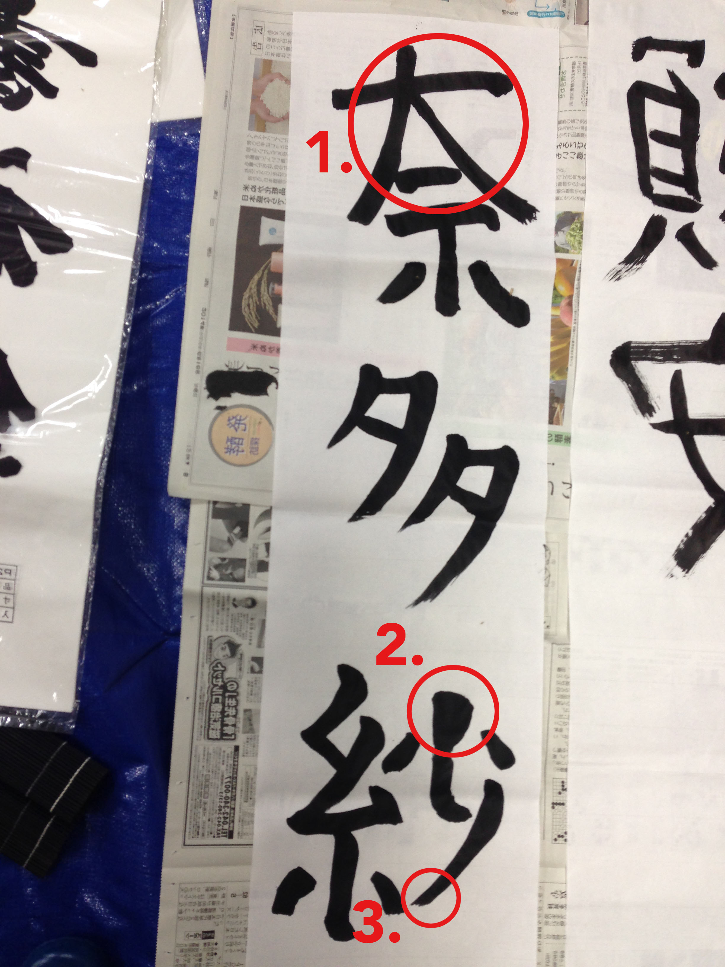
My first egregious calligraphy attempt. A clearly off-kilter first character with inaccurate stroke angles. (Circle 1: Space needs to be wider. Circle 2: Giant blob that shouldn’t be there. Circle 3: Downward stroke needs to be much longer.)
In my Japanese art and literature classes last year, we studied how many elements of Japanese culture contain ideas about traversing dichotomy, with one of the main themes being the space between life and death or the permanent and impermanent, which Japanese culture treats as more of a continuum rather than two absolutes. I think calligraphy embodies this idea because of the way the letters seem so light and full of motion as if they could dance away, yet each stroke is extremely permanent and cannot be undone. Back at USC, design majors heavily use the computer to make work, with the trusty “undo” button always on our side. Japanese calligraphy doesn’t know the meaning of this button, or “CTRL-Z;” it’s pretty much an all-or-nothing game. Too slow, and the brush leaves an unfixable blotch, but too fast, and the ink fails to dispense evenly onto the paper. The wrong flick of a wrist, and the letter is ruined forever! Perfect or downright awful are the only options. However, the best letters are the ones that seem so effortless that it is as if they are ephemeral, taking no time or practice toward their creation.
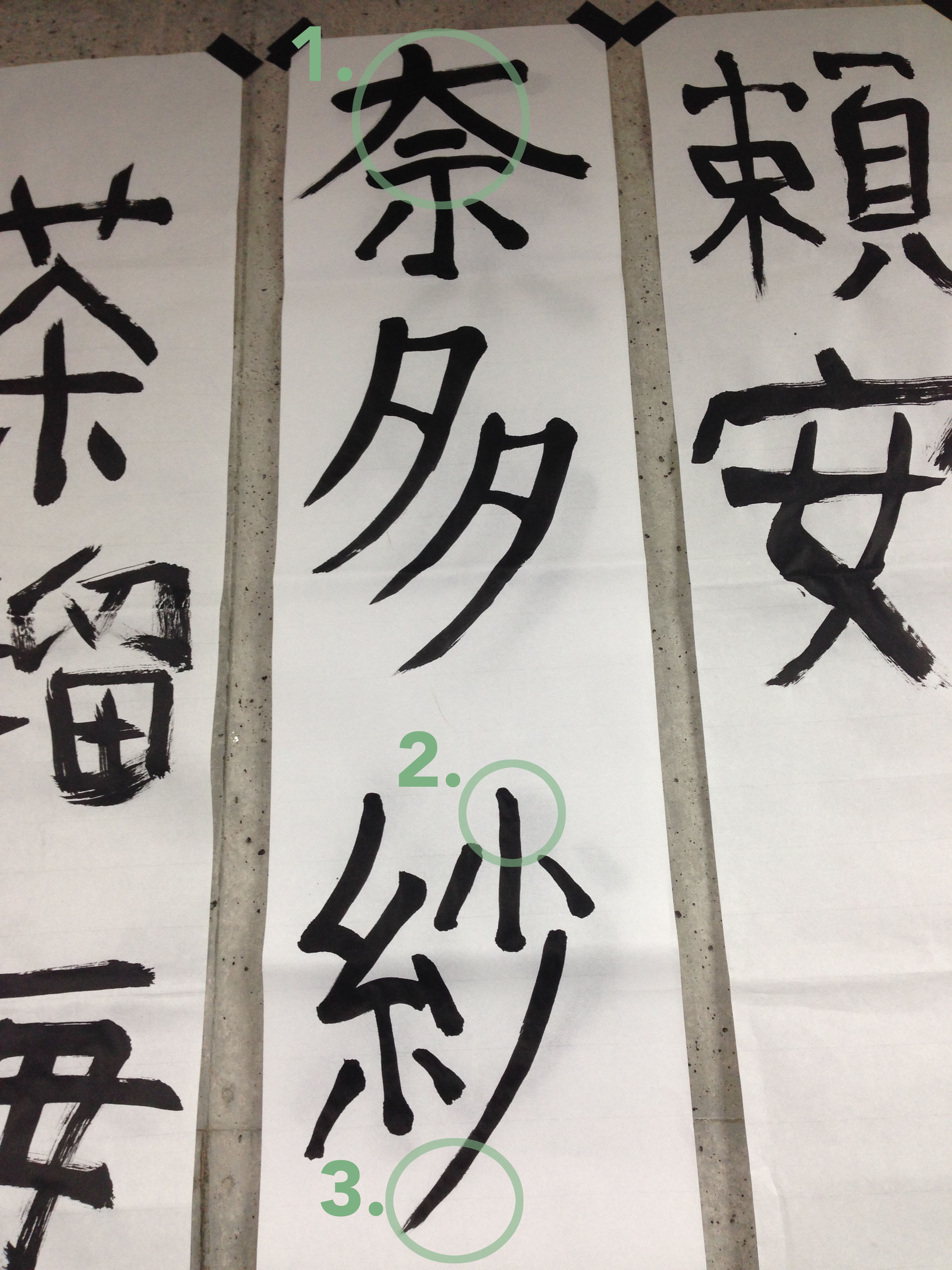
After a couple of tries, here is a much improved calligraphy attempt. I still have a long way to go, but I managed to get the width of the strokes semi-correct and keep a generally straight vertical line throughout. (Circle 1: Better width. Circle 2: Yay! No blob! Circle 3: Correct length of downward stroke.)
Obviously, this perceived effortlessness of Japanese calligraphy is an illusion. Hard work and nail-biting tense moments lie behind every letter! The worst case scenario was when I made an impeccable first stroke only to ruin the character with the next stroke. It actually made me visibly nervous when I just had that last stroke to go and didn’t want to mess up my best calligraphy attempt yet. Fortunately, I started to get the hang of it after a little while (especially since I can be extremely stubborn and a perfectionist when it comes to art), but truly masterful calligraphy takes years of practice, focus, and discipline to make the letters look as if you’ve done nothing at all.
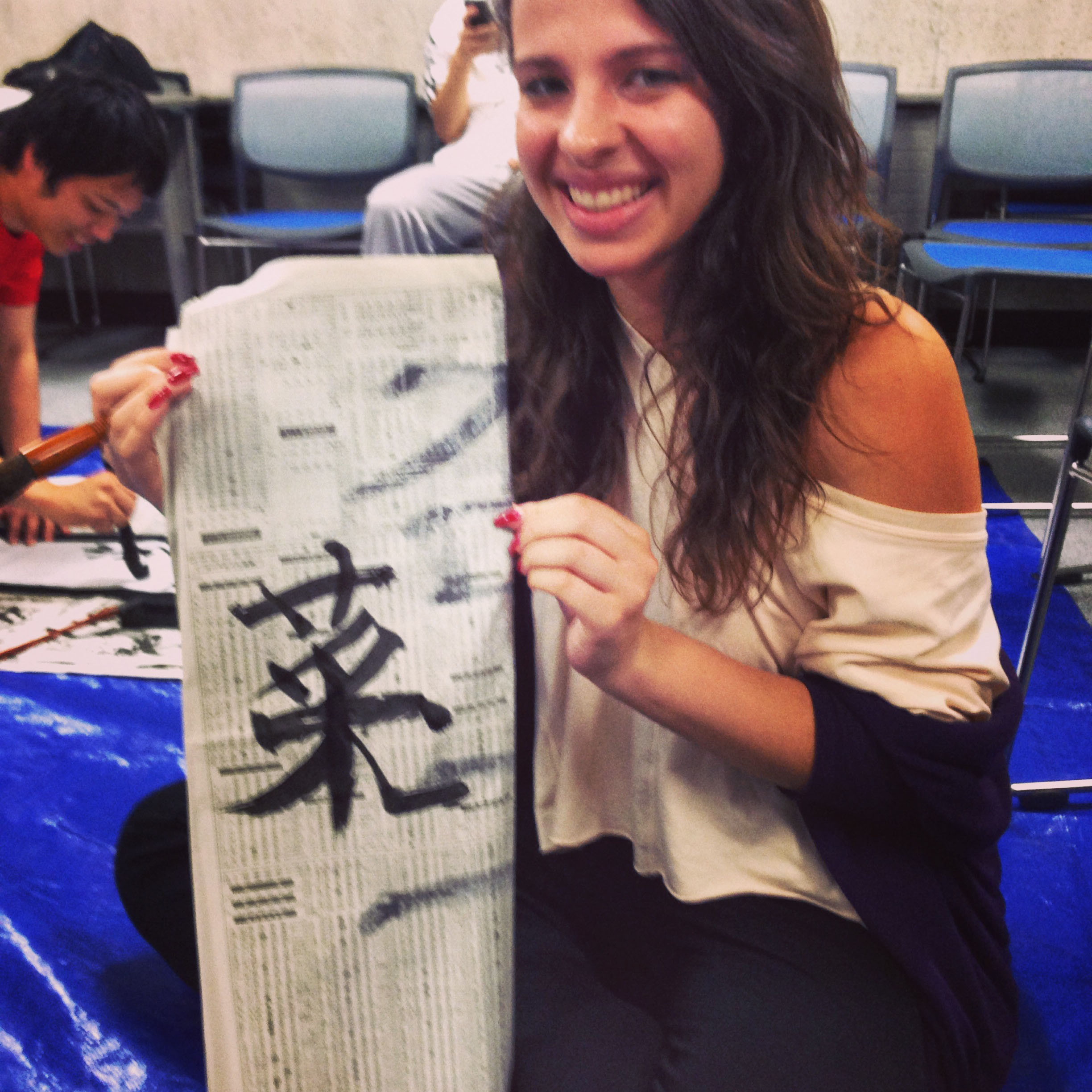
It was almost 11:00pm when I drew one of my best attempts yet! Sadly, it was done on practice newspaper, which got thrown away. ): (You can also see our set-up in this picture. We worked from the top of a vertical paper to the bottom, kneeling on the floor.)